Picking Properties For Reusable Components
For a whole lot of people, the beauty of frontend libraries like React and frameworks like Angular is in components. Components provide a better way to structure code and deliver features that can be extended or isolated and reused with ease. This provides an opportunity: creating components that you can not just use across a project but you can use across multiple projects; components you can just drop it into your project and you're good to go instead of having to create them from scratch and also share with other developers.
This post is not going to be about designing any specific components. We're just going to look at some general properties you might want to take into consideration when creating your component. The idea is that while your component can have a particular look for your specific use case as at when you create it, you want to make it easy to change the appearance of your component without having to re-write the CSS.
The Primary Properties:
Personally, when creating components I intend to re-use, I have certain primary properties I always take into consideration: dimensions, position and colors. Most other considerations actually stem from these three, so they are extremely important when trying to create reusable components.

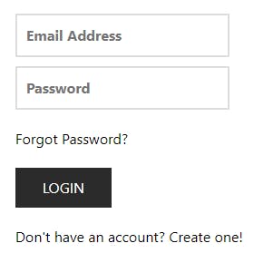
Let's say we want to create components out of the above form. We'll ignore the text/labels and focus on the form elements: the text fields and the button. Each of them has a width, a height and a position relative to other form elements. They also have colors (yes, I know, this form has only black, white and grey but those are still colors). So we can see already that regardless of what component you're trying to create, these three properties absolutely have to be considered and now that we have done that, we can come up with the css properties that affect them.
For dimensions, we have:
- Width
- Height
- Max-width
- Max-height
- Min-width
- Min-height
Position gives us:
- All the margin properties (eg margin-left, margin-bottom)
- All the padding properties (e.g. padding-top, padding-right)
- All the display properties (e.g. flex, block, inline)
- All the position properties (e.g. absolute, relative, fixed)
Color gives us all the color-related properties like color, background-color, border-color etc.
You can use these to specify the dimensions/size, position and color of your component and changing any or all of these could change how the component looks. Thee text fields in the above image aren't spanning the full width of their container but in a different project, you might want them to. Structuring your component in a way that allows you easily change those properties would save you a whole lot effort having to dive into css each time you want to change how your component looks.
The Secondary Properties
Unlike the primary properties, secondary props are those you can basically overlook and you can still have a functional component. While the properties we've outlined for the primary properties are some of the most used properties for most people, they don't cover the complete range of available properties for modifying the appearance of your component. Properties like:
- Border-radius
- Transform
- Transition
- Font-weight
You'd notice that while these are all properties that are used fairly regularly, you can largely get away with not using them at all while styling anything. That's what makes them secondary: they aren't always a necessity, so considering them when creating a component is really a matter of personal choice and how flexible you want your component's appearance to be. For instance, when creating text field components, I typically include border-radius because I regularly use text input components with rounded edges and components with flat edges.
In summary, you can think of the primary properties as essentials you should always take into consideration when trying to pick what style properties on your components should be modifiable and secondary properties as those that you can pick depending on how much flexibility you want to give the component's appearance. With regular experience creating reusable components, you'd get better and better at picking out properties for your components and end up with your own set of primary and secondary properties that may be very different from mine.
Have fun while you're at it!
